DataTelling, a Wintersession studio led by two grad students, focuses on presenting data in compelling ways.
RISD Students Use Video and Animation Techniques to Bring Graphics to Life

Students in a Graphic Design studio called In Motion: Design for Video and Animation are learning best practices for creating short animations. They are exploring different design principles and software in order to add personality and depth to otherwise static graphics. The course was created by designer/coder/educator and recent RISD alum Gabriel Drozdov MFA 24 GD, who says it was inspired by a Painting department course he took led by faculty member Bill Miller 91 PT and builds on the syllabus created by faculty member Rafael Attias 91 GD, who normally teaches this course but is currently on sabbatical.
“My goal in designing the course was to find a happy balance between technique and creativity,” Drozdov says. “Each prompt or assignment focuses on a specific skill, practice or medium. By working on these bite-size animations, students have the freedom to explore a range of possibilities that grows along with their skills.”
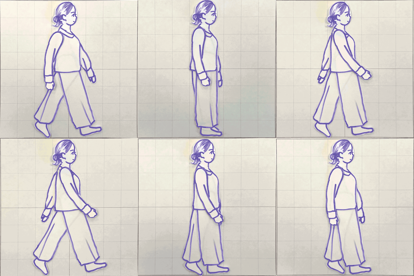
The class is learning to use techniques like stop-motion animation and early Flash animations through hands-on projects. Using Adobe Photoshop, Premiere Pro and After Effects, early assignments included short-form projects like making a hand-drawn animation of a bouncing ball and a stop-motion animation of a person walking. As the semester progresses, students are creating longer-form pieces inspired by prompts like “make something deliberately ugly with lots of canned effects” and “make something loud and expressive.”

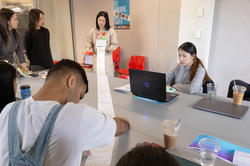
During a mid-semester round of crits, students showed work based on scripts created as a group using an approach inspired by the game Exquisite Corpse. One person writes the first line of text and then passes it to the next person to write the next line, and so on. At the end of the exercise, each student had a script to use as the foundation for a video.
Grad student Vishakha Ruhela MFA 25 GD wanted to create the effect of an old film. Ruhela read the script in class as the video played a sequence including a traffic circle, round sunglasses on a dog, a cloud, a waterfall, the dog getting arrested, a cat smoking a cigar and a spinning ballerina.
“It’s unhinged, but somehow it makes sense,” Drozdov said during the crit. Students found Ruhela’s use of straight cuts between clips to be effective but suggested that they rework the pacing. “I will record the narration and am also considering adding Charlie Chaplin-style captions,” Ruhela said.


Grad student Andrea Mato MFA 26 GD showed a video of different abstract clips set to old horror film-like music and incorporating phrases like “my cheeks are melting” in white text against a black background. The group agreed that Mato’s pacing was consistent and the project as a whole was cohesive. Drozdov noted that she could add “shock value” by varying font weight, typeface and scale.
“We want to be wowed by the frame we’re in,” he added. Mato wondered if others found any of the elements to be cheesy. “‘Cheesy’ usually means obvious,” Drozdov responded. “I think it’s OK if things are obvious as long as they’re effective.”
For their last project, students are creating a longer animation incorporating new techniques and ideas they’ve learned throughout the semester. Drozdov’s hope is that the group leaves with a broad overview of the field of motion design and a deep understanding of rhythm, timing, sequence, narrative and expression.
“The final project is super open-ended,” says Drozdov. “Anything goes! The goal of the assignment—and the idea underscoring the class—is to build a whole that is more meaningful than the sum of its parts.”
Kaylee Pugliese / Top image: work by Elliot Romano
November 14, 2024


